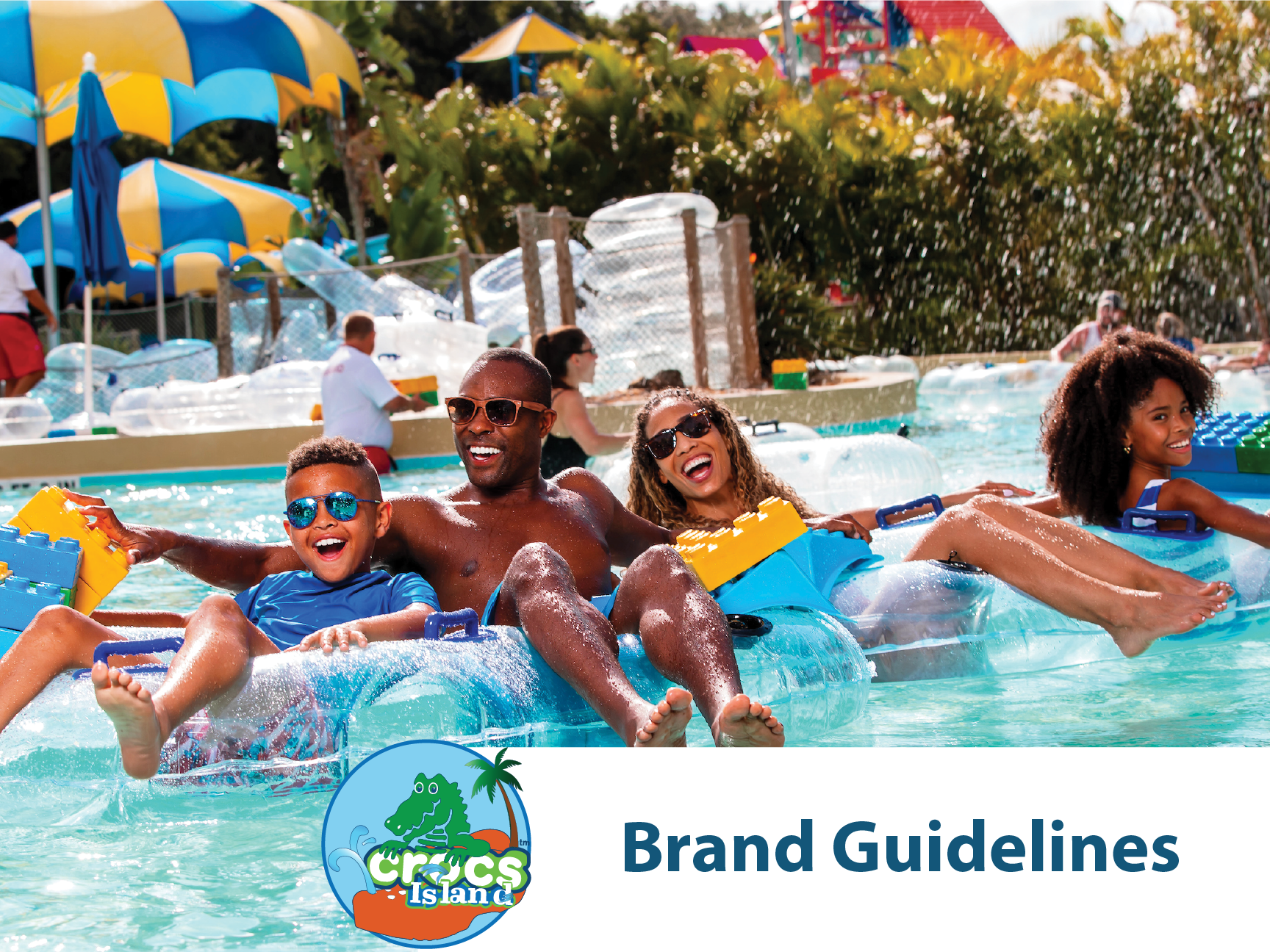
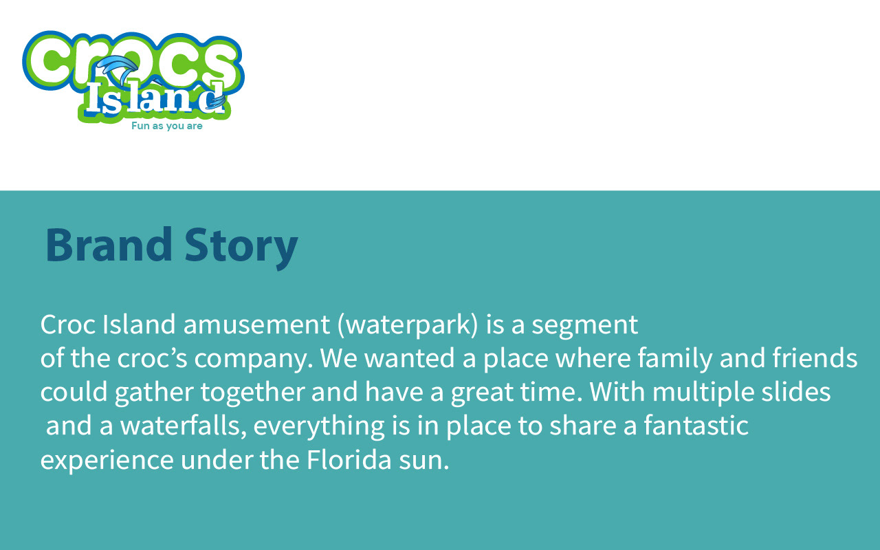
Crocs Island is a segment of the Crocs company.
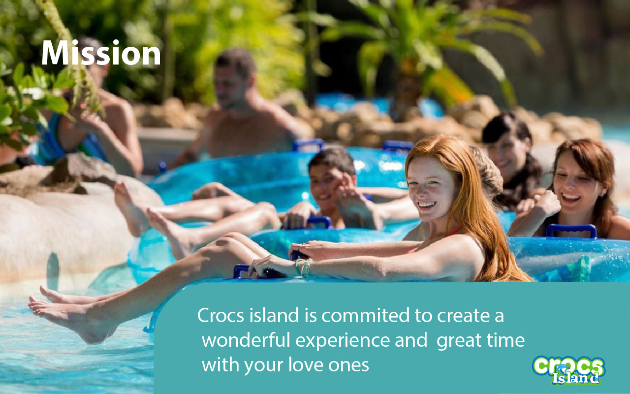
The amusement park (waterpark) that has been created for recreation purposes. We wanted a place where family and friends could come and have a great time together. With multiple slides and a waterfall, everything is in place to have a great time, especially in the summer season. The overall brand should represent water, fun and families, and friends while maintaining the identity of the crocs brand. the guideline will contain the logo, the color palette, typography, and photography for the brand extension
We need to ensure an excellent quality of our services by assuring the safety of our consumers so that they can concentrate on the best part: the fun.
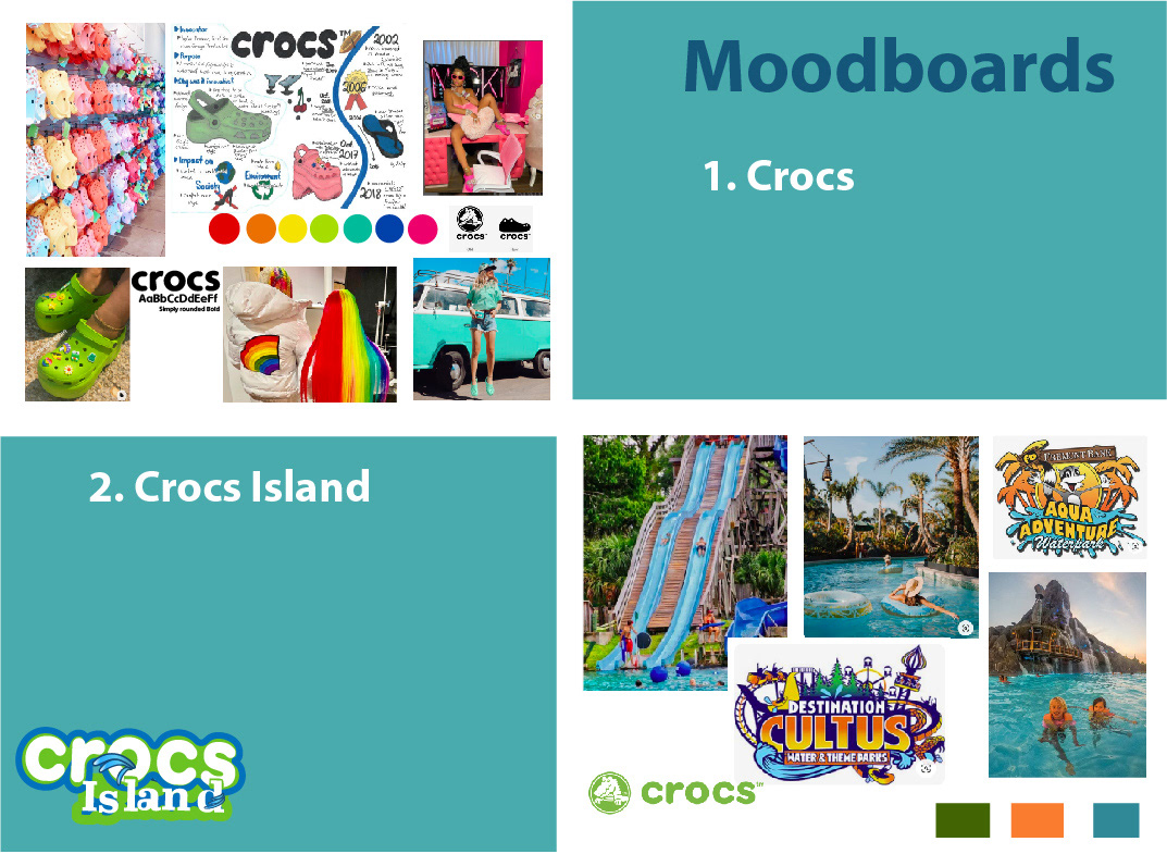
The comparison between two moodboard: One was made at the very beginning to identify the crocs brand and the second one was made to try to define the voice and identity of the new segment.
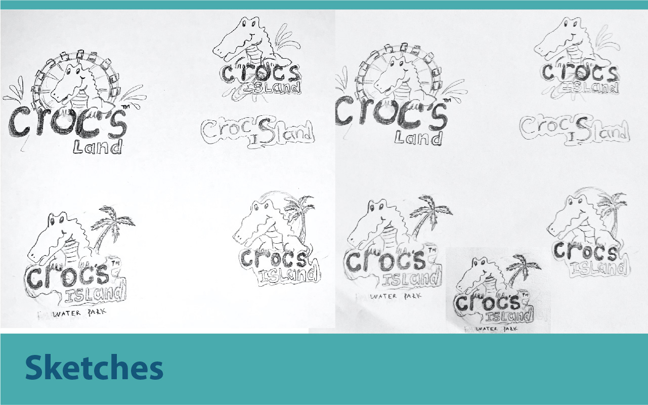
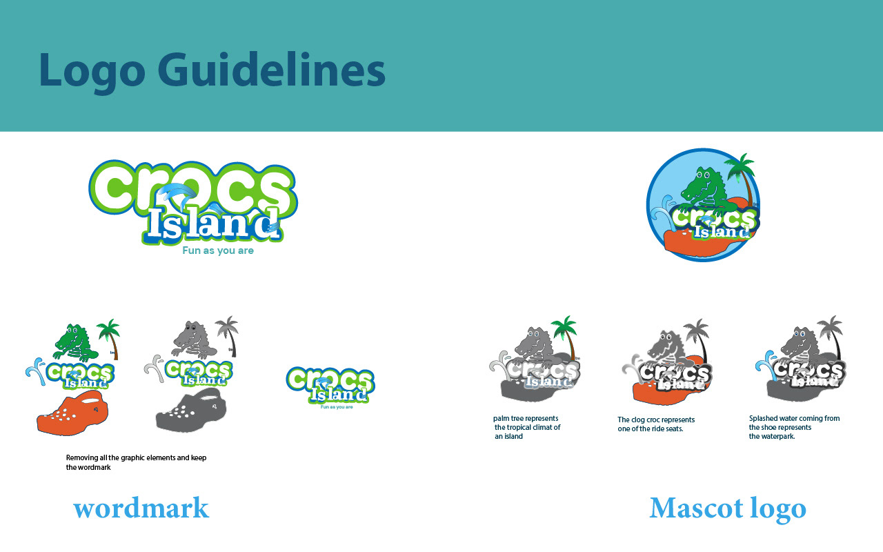
I wanted to incorporate the mascot in the logo because I have seen many brands with their mascots, especially amusement parks. After designing it, I realized that the wordmark logo was a good idea and decided to use both.
User interface
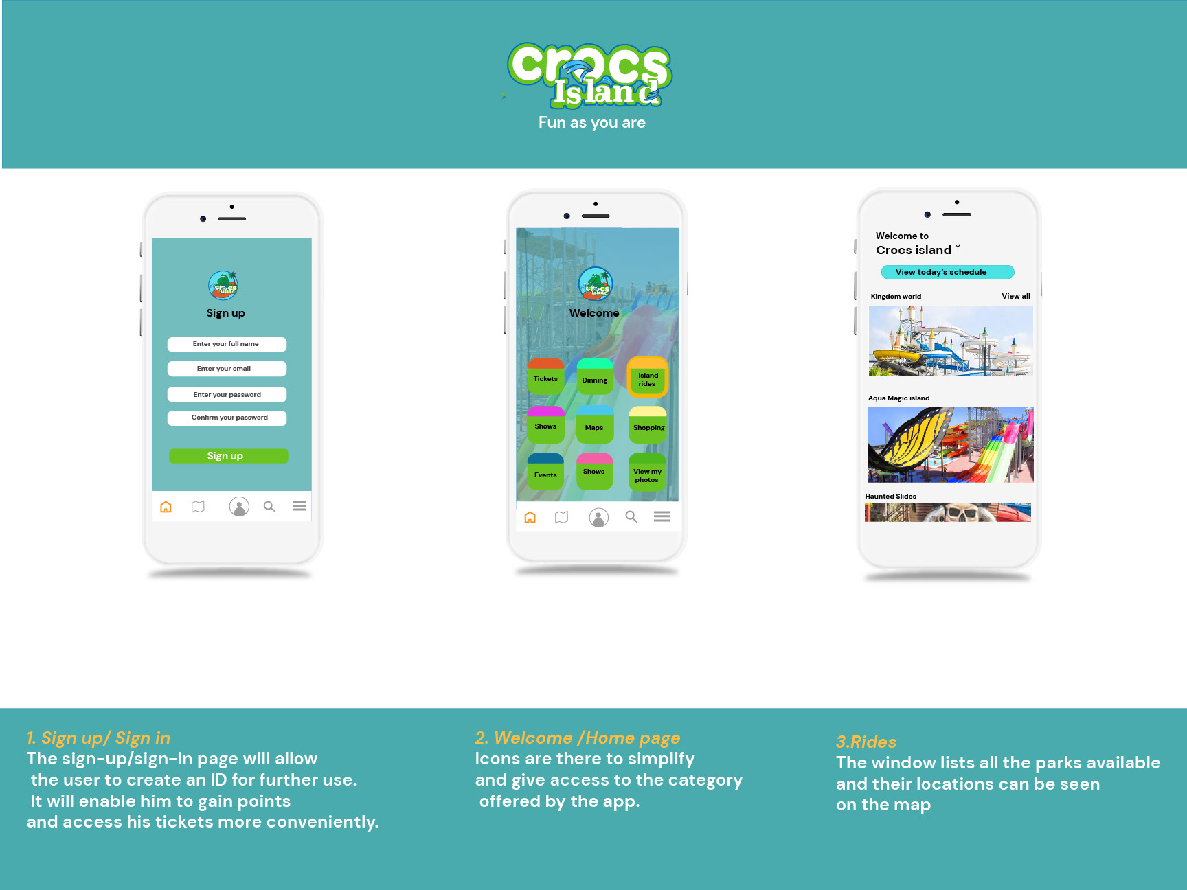
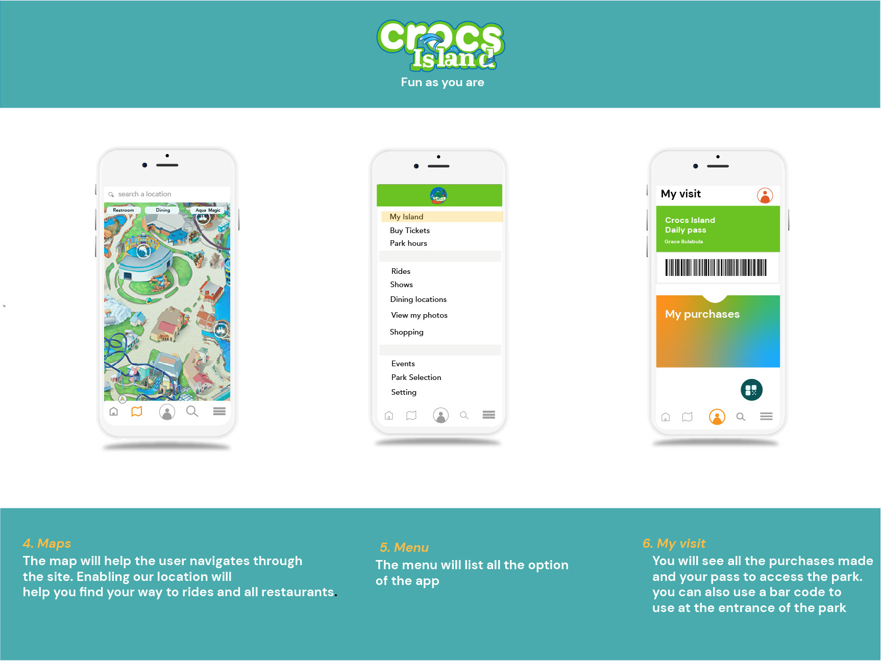
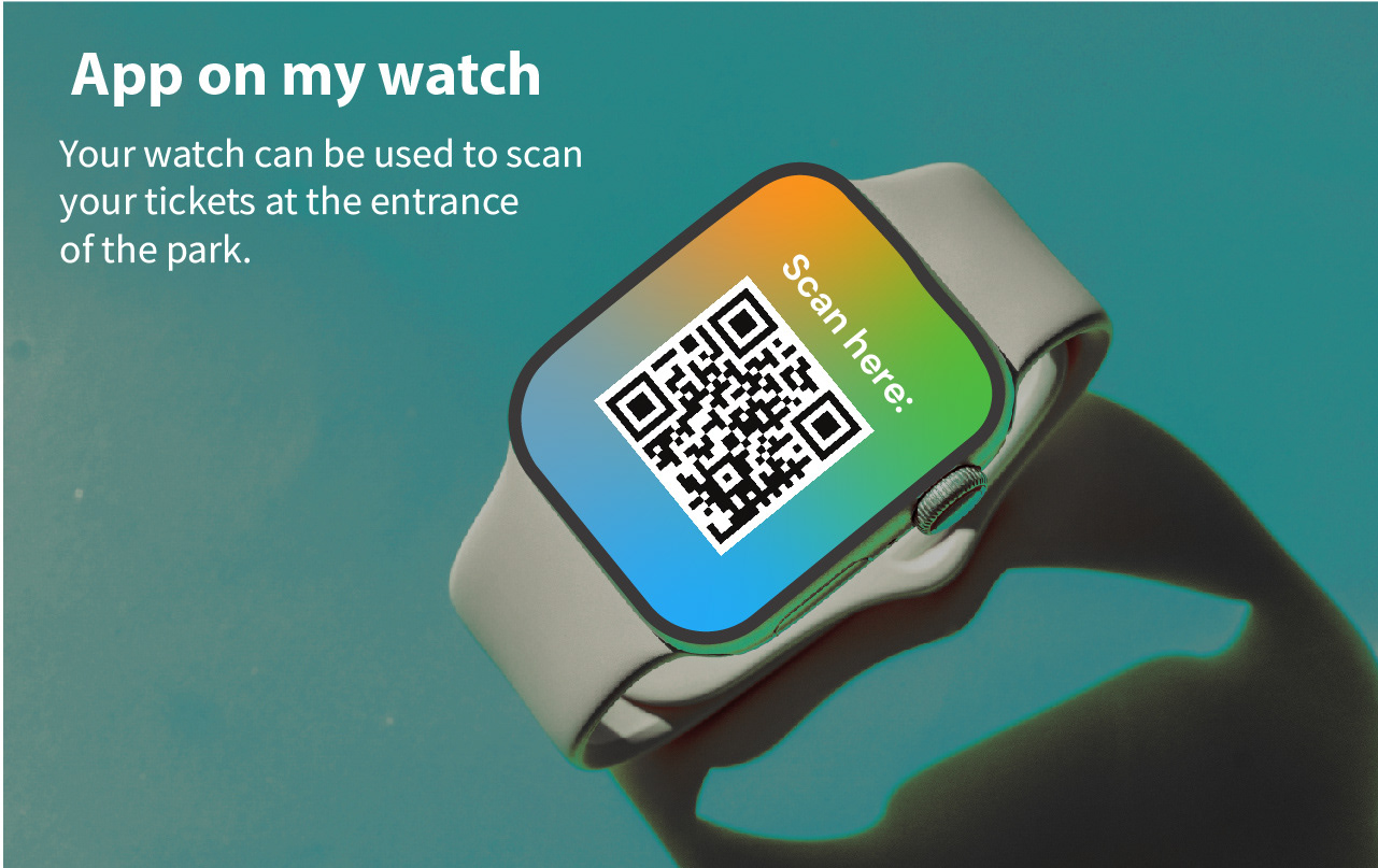
The app is one of the best ways for the users to keep up with the park, especially if it is their first visit. They can purchase tickets there, using the map to find different other locations within the parks and other events and festivals that could take place in the park. We designed The app to make it easier and user-friendly for consumers.
Social media comps
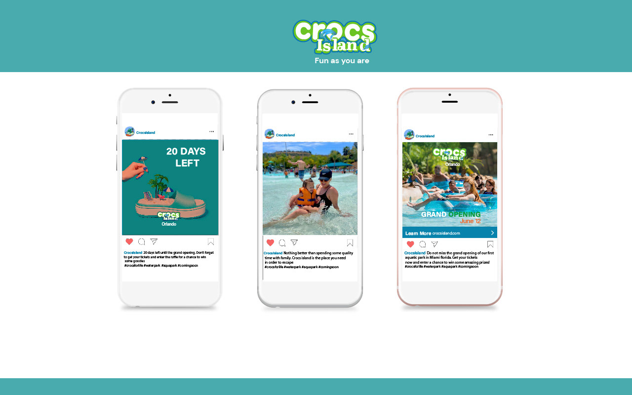
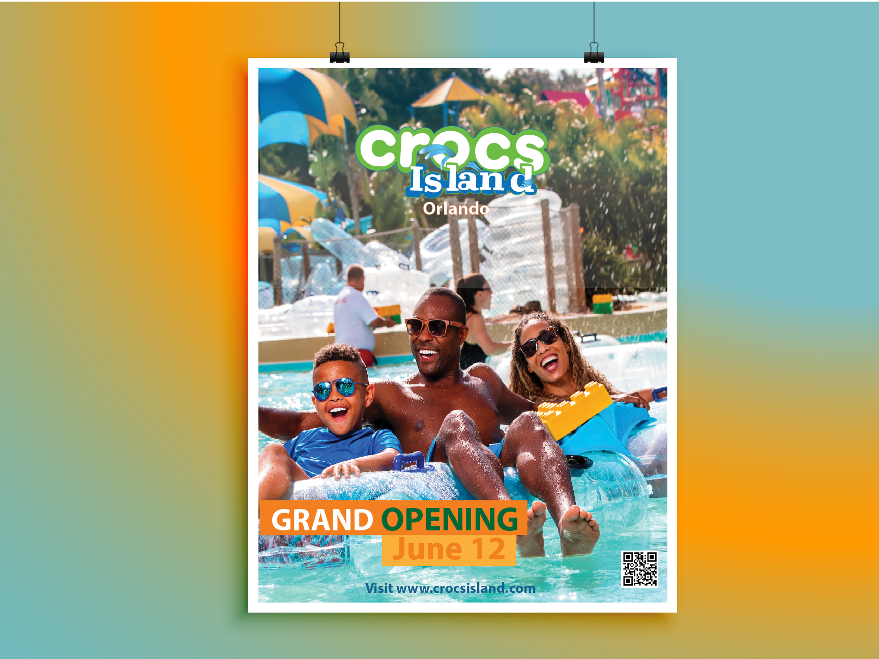
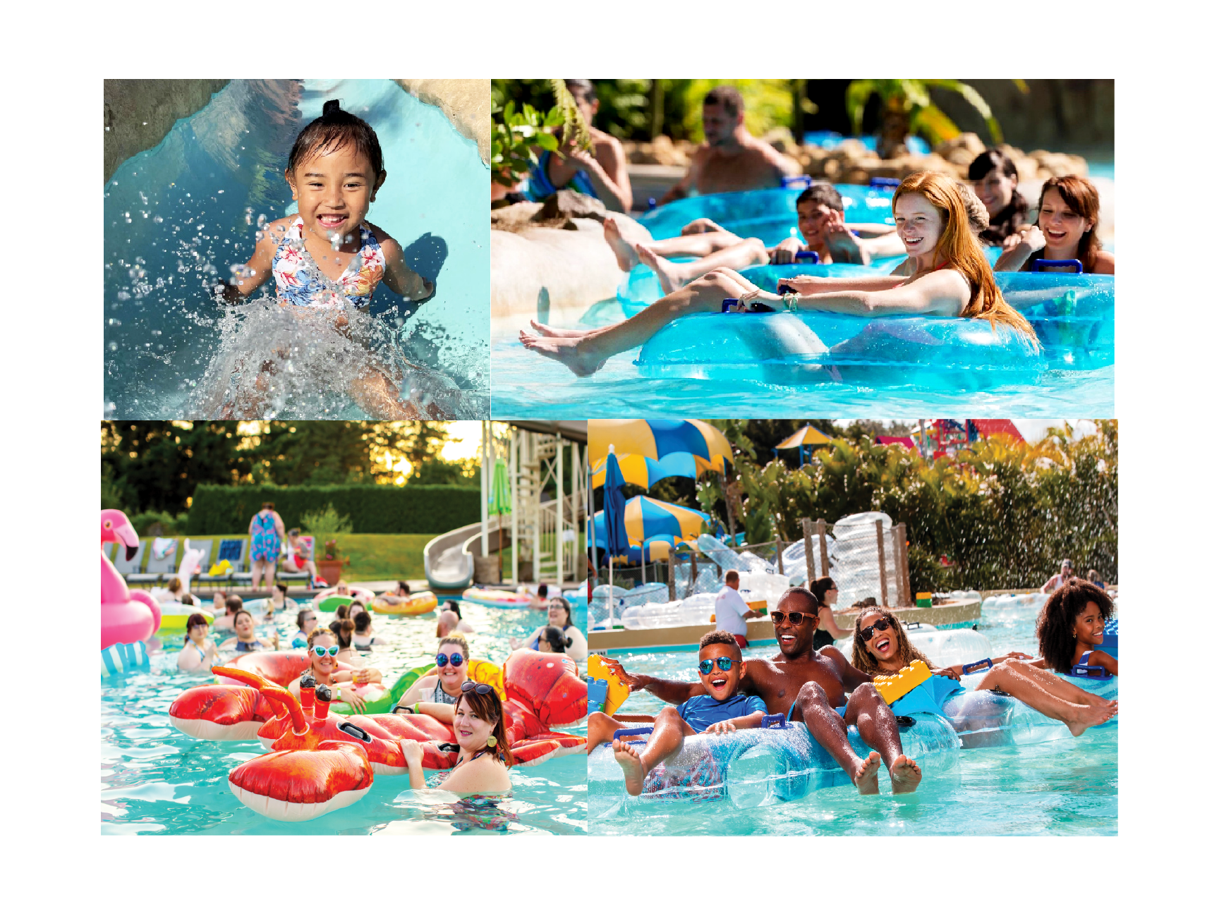
I chose Instagram as a platform to promote the opening of the first waterpark in Orlando, Florida. In the social media comps, it is where we associate the visual with the copywriting to create posts that align with the brand and the message that it is trying to portray. Our campaign reflected the demography that could potentially be our target by using young adult pictures with a lot of fun.
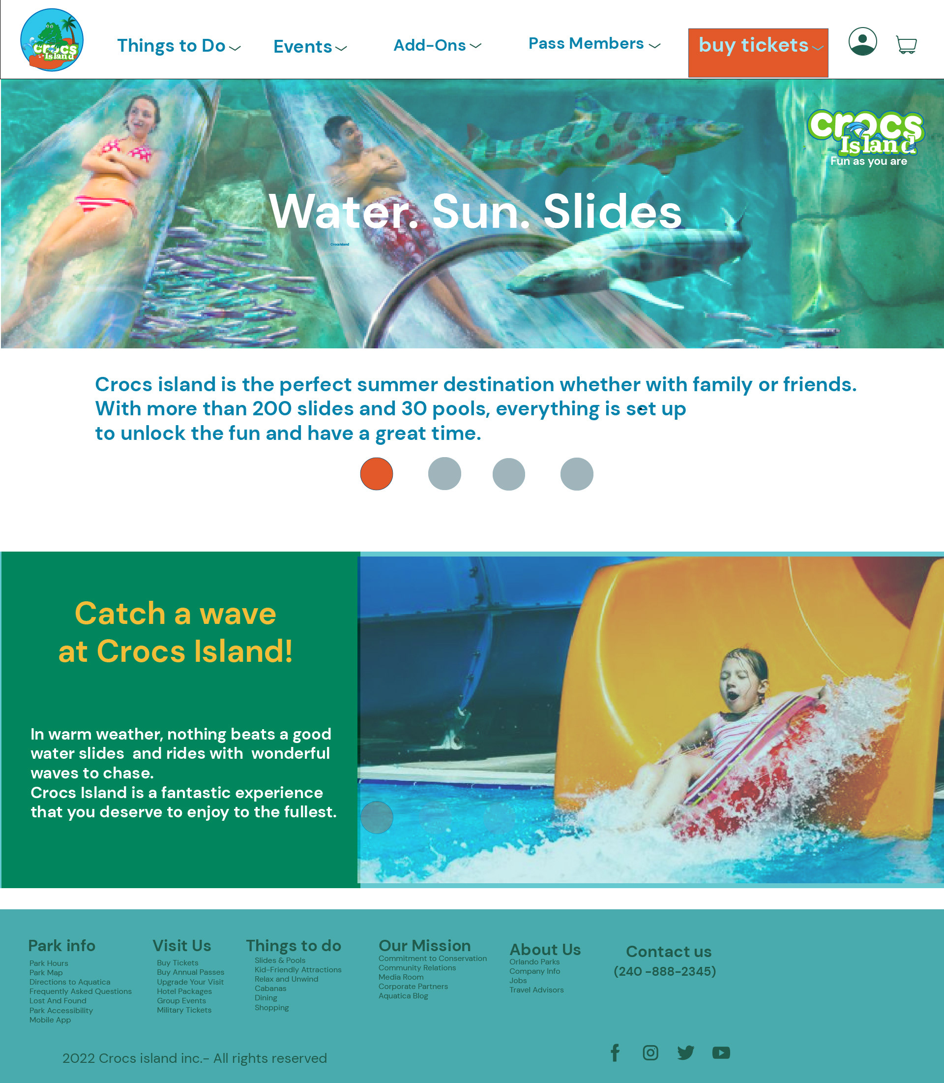
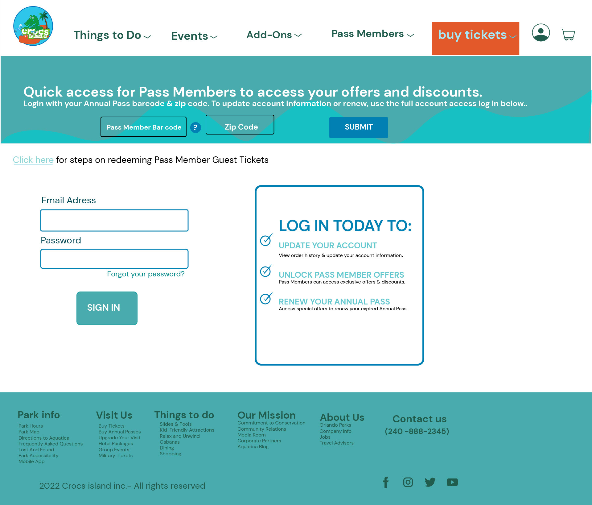
The design of an easy-to-use website was essential. All the buttons are added to simplify the consumer's experience and create a beautiful design that reflects the brand.